The best product copies I’ve seen, read, and where I ended up buying the product, usually had a small plot twist.
They did not begin with the product.
They began with me.
They started with empathy. They understood the frustration. They showed me a problem I already had, but had not explained clearly to myself yet.
We live in a world where information is cheap. AI can summarize almost anything. Search engines can answer basic questions. Every brand can publish a product description in seconds.
But people are not only looking for information. They want to feel that someone understands the situation they are in.
That is why good product copy is not just writing. Good product copy is product understanding combined with deep customer empathy.
I’m Matteo Arellano , and I work on technical SEO, analytics, AI visibility, and organic growth systems. I care a lot about product pages because they sit exactly where marketing, user experience, search, trust, and business performance meet.
Start with the pain, not with the product
Are you feeling really stressed at work? Do you have difficulty concentrating because you have not rested well for months?
Maybe you need a vacation.
The last time I took a vacation, I went for a walk on the beach and swam in the sea. I felt instantly fresh, young, and alive again. I knew I could come back any time because I had a membership with the hotel group, and even during peak season I could stay for a day or two with a strong discount.
But then the normal objections start.
Flights are expensive. I do not know how to get there. I do not want to waste time comparing routes. I do not want to arrive at the airport and start figuring out transport when I am already tired.
Then the offer becomes much more interesting:
The hotel membership also helps you find the easiest flight, gives you transfer options, and helps you arrive without stress.
Do you see the pattern?
The product is not only a hotel discount. The real product is the feeling that the trip is possible, easy, and worth doing.
That is the first rule of product copy: know the real human problem before you write the product page.
You have to test the product yourself
In order to make good product copy, you must know the customer pain points. And I do not mean in abstract terms.
You should test the product you are trying to sell. Then try doing the same thing without it.
Ask yourself:
- Does this product improve my experience?
- By how much?
- Does it make my life easier?
- Does it remove stress?
- Does it save time?
- Does it make me feel more confident?
- Does it help me get something I deeply want?
This is where the copy begins. Not in the feature list. In the lived difference between using the product and not using it.
Some examples:
Love
Does your customer get to see loved ones more often because of what you sell?
Freedom
Does your customer get more time for themselves, their family, or their own hobbies?
Money
Does your customer increase sales, reduce waste, protect income, or improve their lifestyle?
Health
Does your customer feel cleaner, safer, calmer, better rested, or more in control?
Status
Does your customer feel proud to own, use, share, or recommend the product?
Certainty
Does your customer feel less afraid of making the wrong choice?
Once you have evidence that your product actually delivers one of these outcomes, then you can explain it in a clear way.
Clarity is the bridge between what you know and what buyers see
A seller knows too much about the product.
You know the features. You know the manufacturing process. You know why you made certain decisions. You know what changed from the previous version. You know which competitor is weaker. You know which details matter.
The buyer does not.
The buyer lands on the page and tries to answer simple questions:
- What is this?
- Is it for me?
- What problem does it solve?
- Why should I trust it?
- What happens if I do not like it?
- Is there a hidden cost?
- What makes this better than the other options?
Nielsen Norman Group has a useful reminder here. Their research summary says users often leave pages in “10–20 seconds,” and that clear value propositions can hold attention for longer.
That is brutal but fair.
If the buyer cannot understand the value quickly, the product page is asking for too much patience.
The product page must match the buying stage
Not every visitor arrives with the same level of knowledge.
Some people land on your page early in the journey. They are still learning. They may not know the category well. They are comparing options and building trust.
Other people arrive after checking many alternatives. They are more demanding. They have seen similar claims before. They need sharper proof, better comparisons, and faster clarity.
This matters because your product copy should help both types of visitors.
| Visitor type | What they need | What your copy should do |
|---|---|---|
| Early-stage buyer | Understanding and trust | Explain the problem, show the benefit, remove confusion. |
| Comparison buyer | Specific proof | Show differences, limitations, tests, numbers, reviews, and guarantees. |
| Seasoned buyer | Speed and confidence | Make the value easy to scan. Do not bury the strongest evidence. |
| Risk-sensitive buyer | Safety | Make delivery, returns, cancellation, warranty, and support easy to understand. |
Transparency sells more than tricks
If your product page is one of the first pages the customer sees, you have an opportunity to create trust.
The easiest way to do that is to be transparent.
No hidden fees. No surprise add-ons. No “premium” features that appear only after the customer has invested time. No confusing cancellation rules. No contract clauses hidden in small text.
People can accept paying more when the value is clear. What they hate is feeling tricked.
This is why lifetime products are becoming interesting again in a world full of digital subscriptions. People like subscriptions when the ongoing value clearly outweighs the cost of buying or owning the product. But if the subscription feels like a trap, customers will notice.
Make cancellation easy. Show refund policies clearly. Give guarantees where they make sense. Respect people if they ask for a refund.
Also, own the limitations.
Your tool may solve a specific problem but not another one. Your vacuum may be amazing for dust but expensive. Your SaaS may save time but need setup. Your membership may give great access but only in selected locations.
That is acceptable. Good customers know products have limitations. In many cases, being honest about limitations increases trust.
Why product pages still have a lot of room to improve
This is not just opinion.
Baymard Institute’s product page benchmark found that 52% of desktop ecommerce sites, 62% of mobile ecommerce sites, and 64% of ecommerce apps had “mediocre or worse” product page UX performance.
Baymard also reported that only 48% of desktop sites and 38% of mobile sites had “decent” or “good” product page UX performance.
That is crazy when you think about it.
The product page is often the place where the buyer decides whether the product is worth buying. Yet many product pages still make people work too hard.
A good product page should help the customer understand the product, compare it, trust it, and move forward without feeling pushed.
Dyson is a strong example of product copy and product education
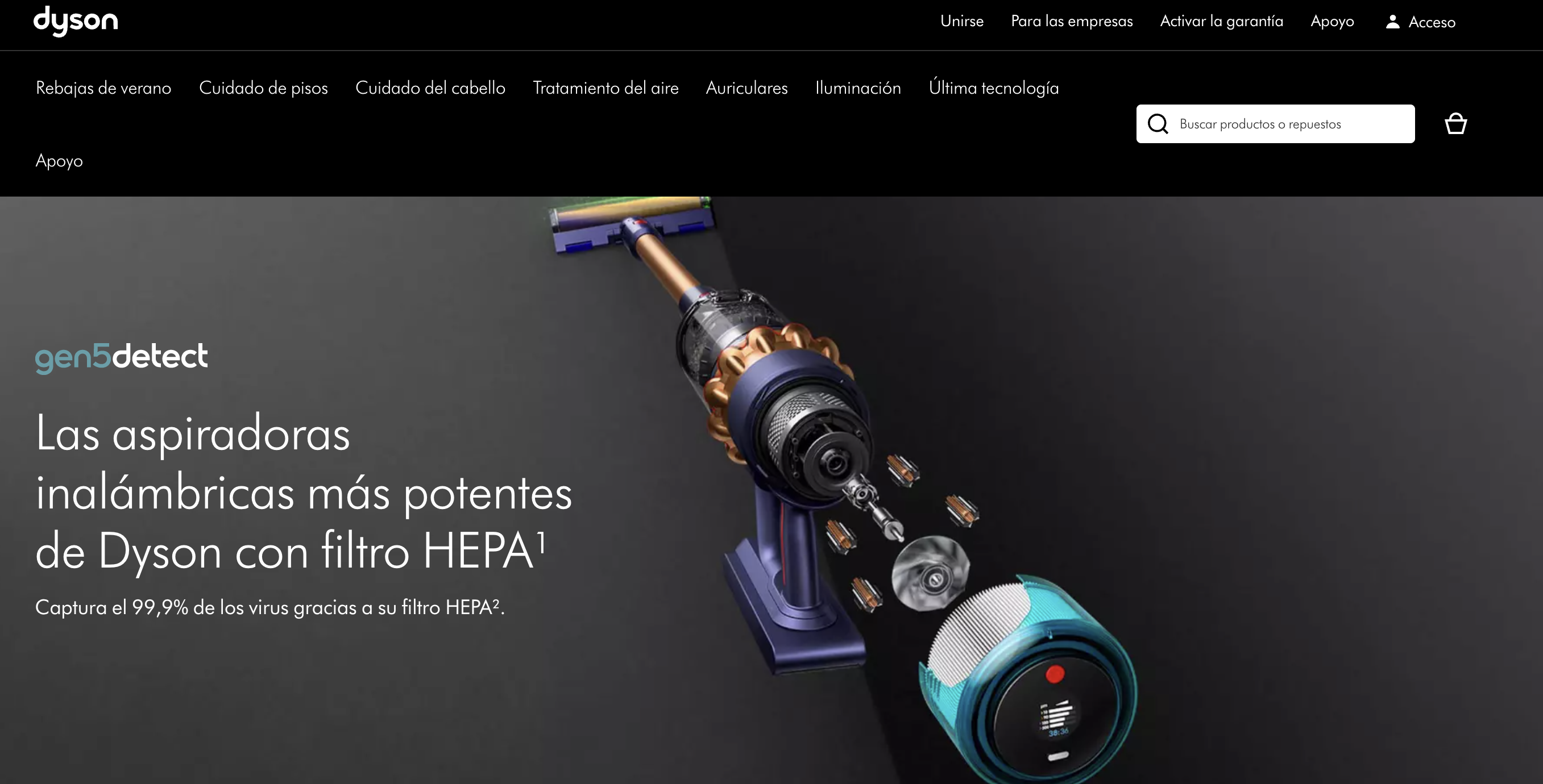
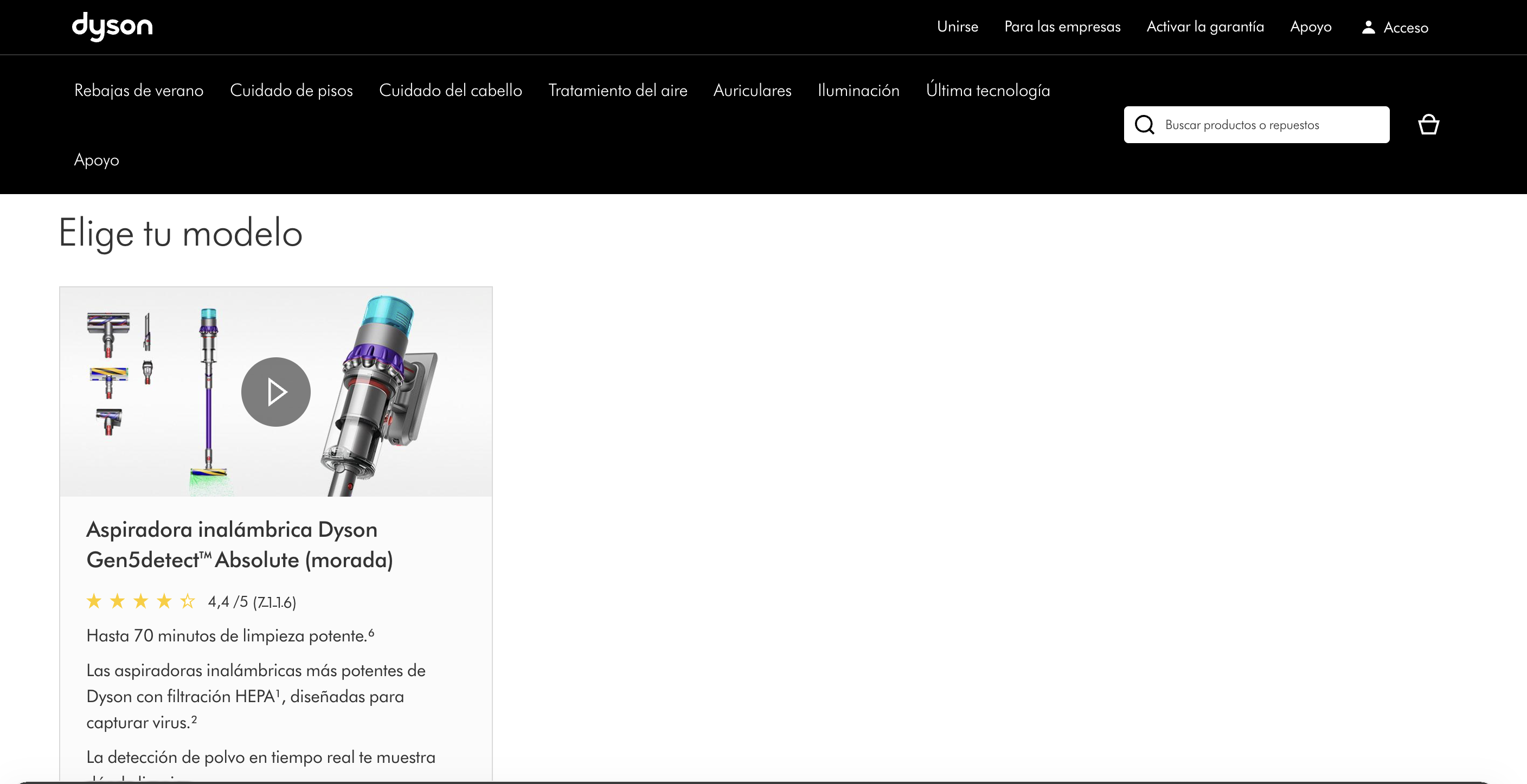
I was looking at the Dyson Gen5detect page, and this is where the product copy becomes very interesting.
A weak vacuum cleaner page would say:
Powerful cordless vacuum cleaner with advanced filtration.
That is fine, but it is forgettable.
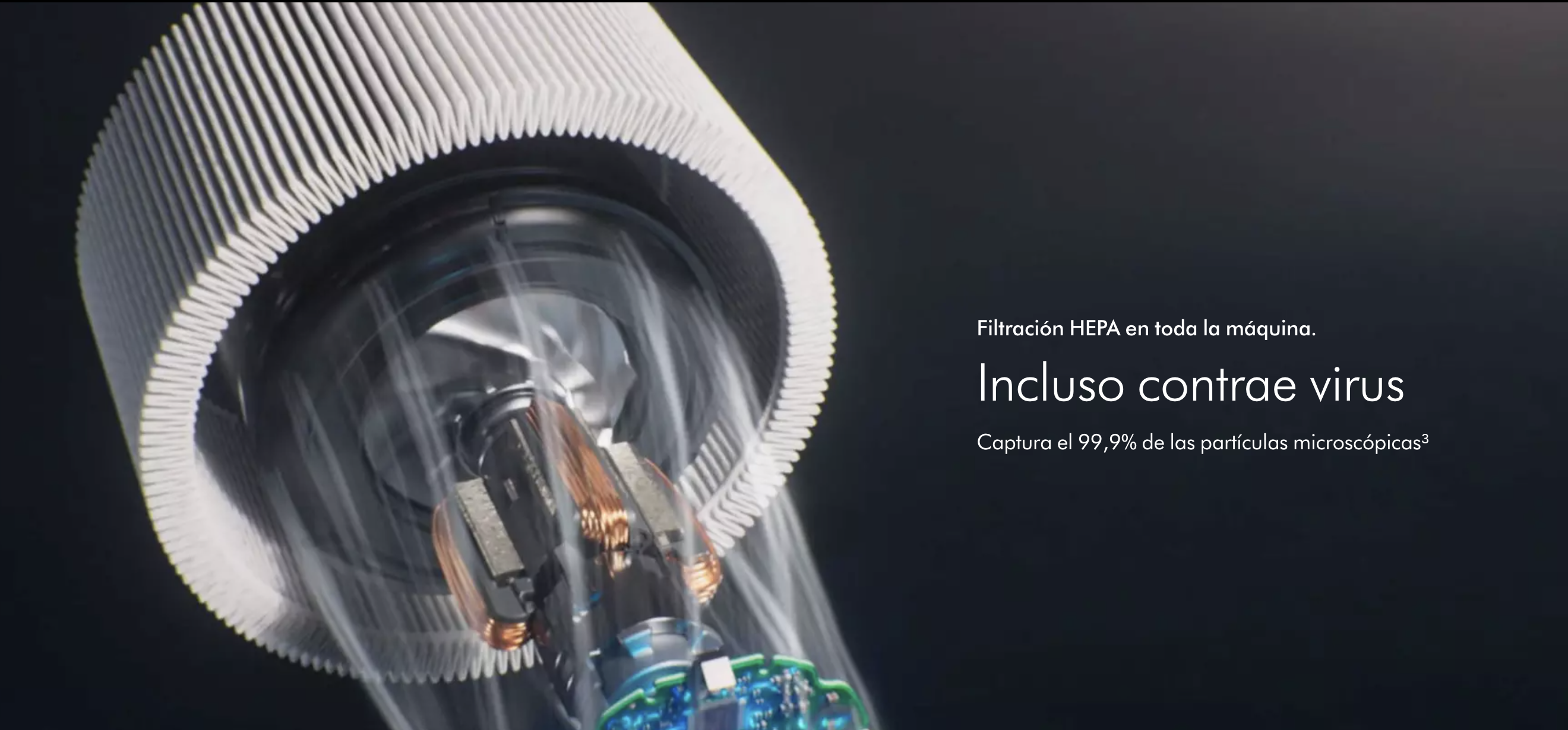
Dyson does something stronger. The page teaches you what the product does through visuals, motion, product components, and benefit-led claims.
On the official Dyson product page, the Gen5detect is presented with specific claims: 280 Air Watts of suction, up to 70 minutes of run time, dust illumination on hard floors, 99.99% HEPA filtration, and a dust sensor that counts particles up to 15,000 times per second.
Those numbers matter because they turn vague quality into something more concrete.
“Powerful” is vague.
“280 Air Watts” is specific.
“Good filtration” is vague.
“Whole-machine HEPA filtration captures 99.99% of particles down to 0.1 microns” is specific.
That does not mean every customer understands microns. But the page gives the impression that Dyson knows exactly what it is talking about. That builds confidence.
Good product copy teaches without making the buyer feel stupid
This is one of the most important parts.
When I keep scrolling on the Dyson page, I can see product components moving. I understand how the vacuum is built. I understand the relationship between motor, filter, cleaner head, sensor, and screen.
I do not need to read a technical manual.
The page teaches me through motion, visuals, and simple benefit-led copy.
This is why product copy should work with product design, visuals, interaction, and page structure. The words alone cannot carry the whole experience.
A strong product page usually combines:
- Clear problem framing
- Specific product claims
- Real use cases
- Visual proof
- Technical explanation without heavy language
- Transparent pricing and returns
- Customer reviews
- A simple buying path
That is why I like the Dyson page. It sells, but it also educates.
When should the product card appear?
Many websites show the product card too early.
Price, color, quantity, add to cart, delivery, payment method.
Those are important. But if the buyer still does not understand the product, the product card arrives before the sale has been earned.
In many cases, the product card should appear after the critical benefits are clear.
For a vacuum cleaner, that may mean:
- How strong is the suction?
- What does it remove?
- Can it clean pet hair?
- How long does the battery last?
- How does the filtration work?
- Is it easy to empty?
- What comes in the box?
- What happens if I do not like it?
Once those questions are answered, the product card feels natural.
A simple product copy checklist
If I had to review a product page, I would not start by rewriting every sentence. I would first check whether the page answers the buyer’s real questions.
1. Pain point
Does the page clearly show the customer problem before presenting the product?
2. Specific outcome
Does the copy explain what improves in the customer’s life, workflow, home, body, business, or routine?
3. Proof
Does the page include numbers, demonstrations, tests, reviews, guarantees, or visual evidence?
4. Clarity
Can a new visitor understand the offer in a few seconds without reading the full page?
5. Trust
Are refunds, returns, cancellation, delivery, warranty, and support easy to understand?
6. Limitations
Does the page avoid pretending the product solves every possible problem?
7. Visual explanation
Do images, motion, diagrams, or interactions help the customer understand the product faster?
8. Buying path
Is the product card placed where the buyer has enough information to make a decision?
What I would prioritize first
There are many small details you can improve on a product page. Button copy, font size, badges, icons, review placement, image order, and comparison blocks all matter.
But I would not start with one hundred tiny changes.
I would start with two areas.
First, understand the pain points. Test the product. Watch people use it. Read reviews. Look at complaints. Ask customers what made them hesitate before buying. Find the emotional and practical reason behind the purchase.
Second, improve clarity. Make the page easier to understand. Make the benefits visible. Make the proof specific. Make the limitations honest. Make the buying path simple.
If you do those two things well, the rest of the page becomes much easier to improve.
Final thought
Great product copy is about explaining things in a way that don't feel you're selling a product. You are instead solving a real problem!
It is the bridge between what the product can do and what the customer deeply wants.
If you know the pain, explain the value clearly, show proof, reduce risk, and respect the customer’s intelligence, your product page has a much better chance of selling.
Be creative. Test new things. Get customer feedback. Then rewrite from reality, not from imagination.
Need help improving your product or service pages?
I can review your product pages, service pages, page structure, internal links, technical SEO signals, and conversion journey to identify where users may be losing trust or clarity.
Request a technical visibility checkThe goal is simple: make the page easier to understand, easier to trust, and easier to act on.